It’s hard to believe Windows Phone 7 landed in the hands of our first customers a mere nine months ago. Since then, we’ve been listening carefully to your suggestions to determine how to make the phone even easier, more efficient, and more fun.
Today I want to provide an insider look at some of the navigation improvements in our next release—including ones related to multitasking. As program manager for these features in Mango, it was my team’s job to help you move more easily around the phone, preferably without thinking much about how you got there.
Reviewing the basics
Before jumping right into what’s new, I want to rewind for a minute and recap our navigation philosophy.
There are two hardware buttons on every Windows Phone for getting around: Start and Back. Pressing Start takes you to the Start screen, populated by Live Tiles that can be pinned, removed, and reordered to suit your tastes. Start is both a launch pad for favorite apps and your personal space. It’s a big part of what makes your Windows Phone unique.
Flicking left takes you to the App list, where all your apps are ordered alphabetically. The App list is consistent and predictable. You can reliably find an app (even when it’s infrequently used) by name.
Finally, there’s the Back button, which pretty much does what it says: takes you back to the place you came from or left off.
That’s it. The model is pretty simple. But, as always, there’s room to make it better.
Finding apps faster
I have about 50 apps on my phone right now—roughly five screens worth. While the App list is predictably alphabetical, it can become quite long over time. Sure, I know where to scroll to find an app. But excessive scrolling is sub-optimal (engineering speak for “it’s a pain”). We’ve also heard this from those of you with large app collections. In Mango, we looked at a number of ways to make this experience better.

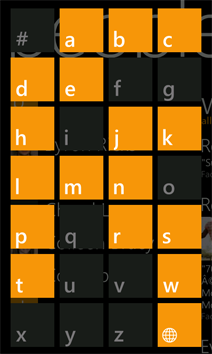
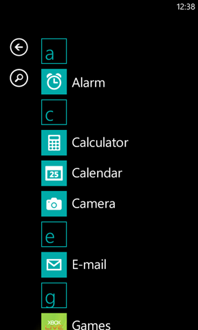
Tapping a header in the People Hub today opens the quick jump menu (left), which can whisk you to a specific section of your contacts list. In Mango (right), we’re adding the same feature and a search option to the App list.
One possibility we explored was ordering apps by how recently or frequently they’re used. While useful, this solution can prove disorienting and confusing, since app order is constantly changing. An App list organized by frequency would probably also look similar to your Start screen, where most people pin the apps that they care about most.
We also wanted the App list to feel consistent with other lists on the phone, like contacts. In the People Hub we use search and a quick jump menu to help you find contacts quickly. Ultimately, we decided that approach was the best solution for the App list, too.
Although there is one slight difference. When implementing the quick jump option, we wanted to balance function with aesthetics. If you don’t own many apps, the feature doesn’t make much sense, since the alphabet headers artificially lengthen the App list, creating gaps that make it feel sparse and unappealing. Hence, you’ll only see the headers when you have installed at least 45 apps.
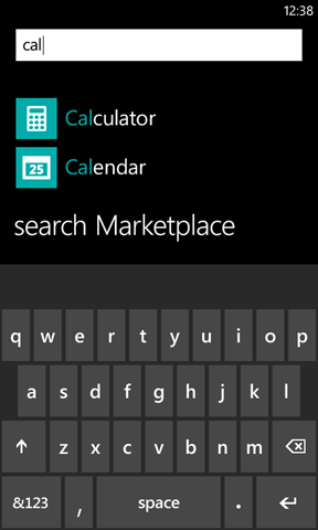
While quick jump is helpful, I have to admit that sometimes it’s easier to just type an app’s name. So we also added a search option. If you’ve used it in People, it works like you probably expect, filtering the list of apps as you type. If you don’t find the app you were searching for, we provide a convenient link to get it from Marketplace by tapping Search Marketplace.
Easier multitasking
Have you ever wanted to quickly continue or finish something that you left off earlier? I run into this quite often. I’m in the middle of an intense Fruit Ninja game when a text message notification pops up at the top of my screen. It’s an I Can Has Cheezburger link. I must tap it! When I do, it takes me to the website, where I find a pic that’s so awesome that I must share it with my Facebook friends.
After all that, I really want to get back to whacking fruit. My instinct is to press the Back button. But if I don’t see what I want after a couple of tries, I usually press Start and navigate from there. What I really need is a way to hyper jump back to a specific point in time.
Sound cool? Say hello to the task switcher.
We believe the best way for someone to navigate between tasks is literally by showing them where they left off. Whether it’s a half-composed email, a game in progress, or the last photo you saw, you can return to it easily in Mango by pressing and holding the Back button.
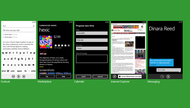
In Mango, pressing and holding the Back button on your phone calls up the task switcher, which makes it easy to quickly pick up where you left off.
When you do, you’ll see a set of “cards” that represent the last 5 things you did or apps you used, arranged in the order you used them. (My team’s nickname for this feature is “visual back”.) These cards remind you what you were doing so you can pick right back up again. This is efficient multitasking.
Flick left or right and tap on a card to resume right from where you left off. The task switcher is designed to be fast and predictable (although it does require app developers to do some work on their end). Don’t get me wrong. I still use the Back button for its original purpose: to navigate within an app and or get back to the previous thing I was doing. But “visual back” helps you resume tasks that are a little farther away.
One design problem we pondered at length was how many cards to show. We wanted the experience to be intuitive and require minimal effort. Five seemed like a good balance. Having only a small number of cards ensures that the task switcher is predictable. Unlike other smartphones, this design also helps save you from having to babysit your apps, tracking which ones are running and manually closing them to conserve battery power. The phone does that work instead.
Of course, I know some people will probably wish there were more cards. As always, we’ll continue to monitor your reaction and reevaluate our design for future releases if needed.
We think getting around on a Windows Phone with Mango has never been easier and more fun. Working on these features has been tremendously rewarding for me. I hope that you’re as excited about what’s coming as I am.
Rachel Jiang, Program Manager, Windows Phone Engineering


