

In this installment of our quality blog series, Jane Liles and Rob Mauceri from the Windows Data Science team share some of the practices we’ve developed during the last few years to measure and improve the quality of Windows.
Measuring the impact of change
We approach each release with a straightforward question, “Is this Windows update ready for customers?” This is a question we ask for every build and every update of Windows, and it’s intended to confirm that automated and manual testing has occurred before we evaluate quality via diagnostic data and feedback-based metrics. After a build passes the initial quality gates and is ready for the next stages of evaluation, we measure quality based on the diagnostic data and feedback from our own engineers who aggressively self-host Windows to discover potential problems. We look for stability and improved quality in the data generated from internal testing, and only then do we consider releasing the build to Windows Insiders, after which we review the data again, looking specifically for failures.
Answering the question, “Is this update of Windows ready?” requires that we design and curate metrics in a way that is reliable, repeatable, precise, true and unbiased. It requires a high level of testing and iteration. We look at the metrics multiple times per week as part of our normal rhythm of the business to better understand the impact of the code changes that our engineering teams put into the product, and to make decisions about where to focus stabilization efforts.
By the time we are ready to ship to our customer base, our metrics must be, at a minimum, at or above the quality levels for the previous release, the idea being that every update should make the Windows 10 experience better. We use these testing methods and metrics throughout the release and track their performance over time, enabling us to ship with higher confidence. We then continue monitoring for quality issues that affect the ecosystem as the update reaches a broader audience.
To understand the quality of each update through data, we divide the feature set of Windows into distinct areas defined by the customer experience. Building on the ability to count unique “active” devices each month, we then focus on the success of the upgrade process and general health of the user experience. From there, we define “measures of success” for key user scenarios that exemplify a best-in-class operating system (OS) experience. For example, we measure success rates for connecting to Wi-Fi, or opening a PDF file from Microsoft Edge, or logging in using Windows Hello.
For any given update of Windows, we have thousands of “measures” (proprietary metrics built on a shared data platform) that we use at the team level to monitor the impact of the changes. Of these, we have just over 1,000 that we incorporate daily into our Release Quality View (RQV) dashboard, which gives us an “all up” product view. We use this dashboard to assess the quality of the customer experience before we ship, i.e., while our engineers and Windows Insiders are running daily and weekly pre-release builds. We continue monitoring the RQV when the product becomes generally available to the hundreds of millions of devices used by our consumer and commercial Windows customers, using the data to spot and quickly fix issues that may arise so that Windows is always improving, even after it is released. In fact, we use measures at every stage of development to monitor the quality of each release, whether it is a feature update or a monthly servicing update. We build these “measures” from Windows diagnostic data and feedback signals to help us understand if the product is working the way it’s supposed to. The diagram below shows what one of these measures looks like.
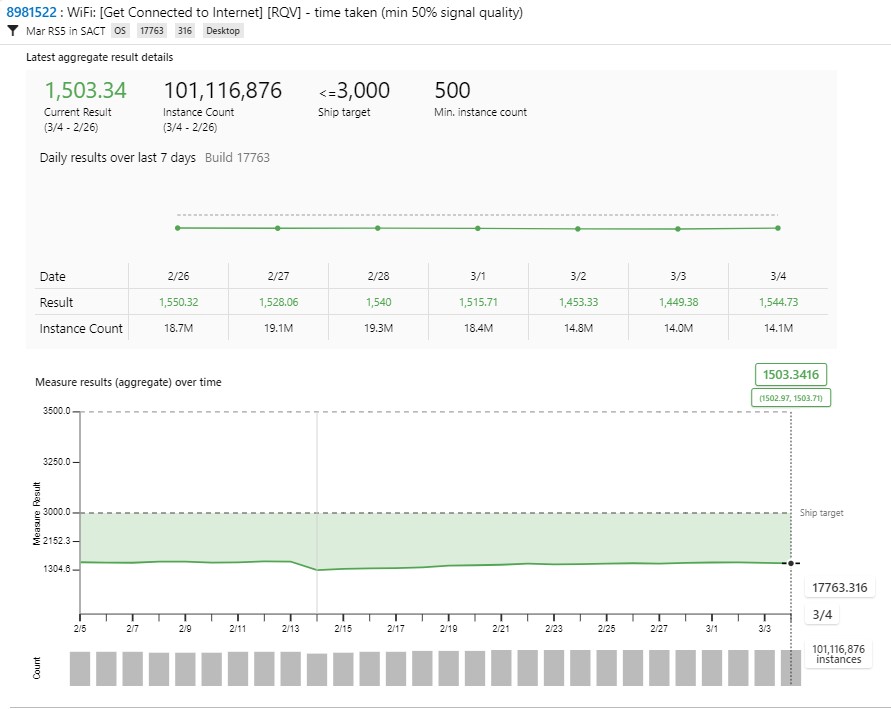
Example measure: Average time to connect to Wi-Fi on a recent Windows 10 update: 1.503 seconds (within the goal of 3,000 ms, measured over 101.1 million connections with at least 50 percent signal quality)
When developing the RQV, we needed to normalize our assessment across many measures, each with a different way of expressing “success.” The measures had to be flexible enough to best capture what is important, for example:
- How should we characterize the experience being measured to influence the right action, for example, defining success as a low failure rate for connecting to Wi-Fi, or the percentage of devices with no failures, or the success rate of deleting browser history via Settings?
- How should we express targets, such as a 99.85 percent success rate when creating a new tab in Microsoft Edge, or <500 milliseconds to launch the Start menu?
- Which unit of measurement should we use, for example, how many milliseconds to open the Action center pane vs. absolute counts of installation rollbacks?
To provide a meaningful view of quality across so many variables, we evaluate each measure with a normalized score, based on the distance to its target. We calculate this score for each of the measures that make up the RQV and provide a summary view for each product area (e.g., networking), sub-area (e.g., Wi-Fi), and for Windows as a whole. We then track the trends towards meeting targets for all areas, with the goal of continuous improvement. If any area starts heading in the wrong direction, away from targets, we can detect it quickly, diagnose and correct the problem, and validate that the measure is tracking towards healthy again.
One of the things we learned as we were developing the RQV was the importance of linking the bugs for problems exposed by failing measures to the measures themselves. Having the ability to validate that a bug fix actually resolved a problem by seeing the same measure return to a healthy range, based on real use by our own engineers and by our Insiders, turns out to be a powerful and useful thing.
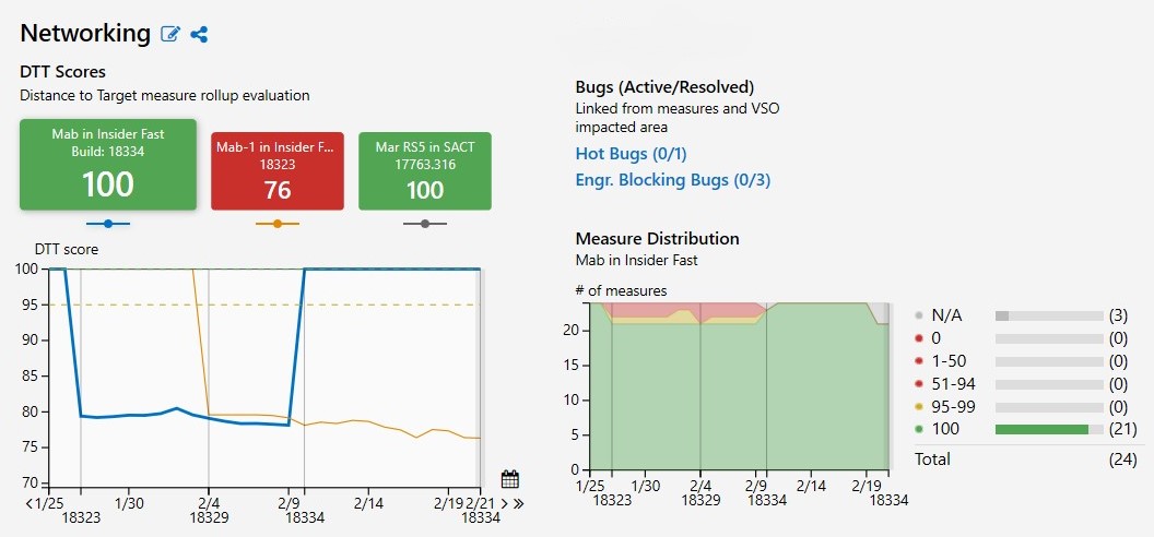
View of measure trend for Networking measures in internal and Windows Insider builds between 1/25/2019 and 2/19/2019 shows an improvement in score (76 –>100) since the previous build
Measures drive action
As anyone who regularly works with metrics has probably discovered, data is only as valuable as an organization’s commitment to using it to inform real decisions and drive action on a consistent basis. Having a dashboard of measures provides limited benefit unless there is a process and accountability for using it.
Today, leaders in the Windows organization meet multiple times each week to review the quality of the latest version of Windows being self-hosted by our own engineering teams and by hundreds of thousands of Windows Insiders, as represented by our RQV measures. Starting with the lowest scoring problem areas, we run down the list of areas whose measures are proportionally farthest from their targets. The engineering owners for those areas are then called on to explain what is causing the problem, who is on point to resolve it, and when they expect the quality of that area, as represented by the measures, to be back within target. We look for both build-by-build differences and the trends of measures over time.
Between these “Release Readiness” sessions, engineers and managers regularly review their measures and customer feedback, investigating failures using analytics tools to correlate cohorts of failure conditions with problems in the code. This enables them to more easily diagnose issues and fix them. Fixes that engineers check into future builds are tracked through the system, so reviewers can see when a fix will be delivered via a new build and can monitor impact as the build moves through its normal validation path: through automated quality gates, to self-hosted devices in our internal engineering “rings,” and to our Windows Insiders. Impactful regressions—again, exposed through measures and user feedback—in quality at any of these stages can halt the progression of that build to the next audience until a new fix (usually in the form of a new build) is available.
It has been exciting to grow a new team culture focused on driving quality through measurements built from our listening channels, and we continue to invest in making it better. In the early days of Windows 10, it took months of curation, review and iteration just to get an initial set of measures that were representative, reliable and trustworthy. It required patience and rigor to get to a state where the measures could tell a credible story. If a feature owner had to explain why the measures weren’t accurately describing what was happening, we had to develop the habit of asking how they were going to fix the measures and when. It didn’t happen overnight, but it did happen, thanks in part to leaders like Mike Fortin, who are passionate about us living by our measures, and to our dedicated teams of data scientists and engineers. We have learned a lot about how to express quality in a customer-centric way through quantitative measurement (at considerable scale), and we’re still learning.
Measure example: Success creating a new tab in Microsoft Edge
One of the hundreds of measures we track is the failure rate of opening new tabs in the Microsoft Edge browser. The success of this action is essential to a good customer experience, but it is also a non-trivial operation behind the scenes. This makes it a good action to track as a quality measure.
We detect that a new tab is being created by looking for a sequence of three diagnostic events: (1) TabAddedToViewModel, (2) AddNewTabCreateInstance and (3) ConsumedPreLoadedTabInstance. If each of these events occurs in order, and within the prescribed amount of time, the action is considered a success. However, there are many events that can cause the operation to fail. For example, if we see the TabAddedToViewModel event, but the sequence is not completed in time, then the action is deemed a failure.
Here is the logic behind this measure illustrated as a state model, which is the way we describe the event pattern in the measure definition:
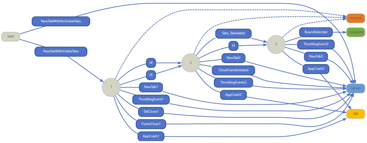
State machine diagram for “percentage of Microsoft Edge Tab Failures” measure
We aggregate all success and failure outcomes to determine the overall reliability of the action. The percentage of successes over all successes and failures is the measure result. In this case, the “target” or goal that the Microsoft Edge team set for this measure is .15 percent, so if the average percentage of tab creation failures is .15 percent or less over a rolling seven-day period, then the measure is passing.
When we view the results for a measure, we compare across builds to understand the following:
- How is this measure performing for this audience of devices with this specific build?
- Is this feature working better in this build than in the last build we released to this audience?
- How is the quality of this feature in this build compared to in the latest released version of Windows?
An example comparison of results for this measure across three different builds on Feb. 24 looks like this:
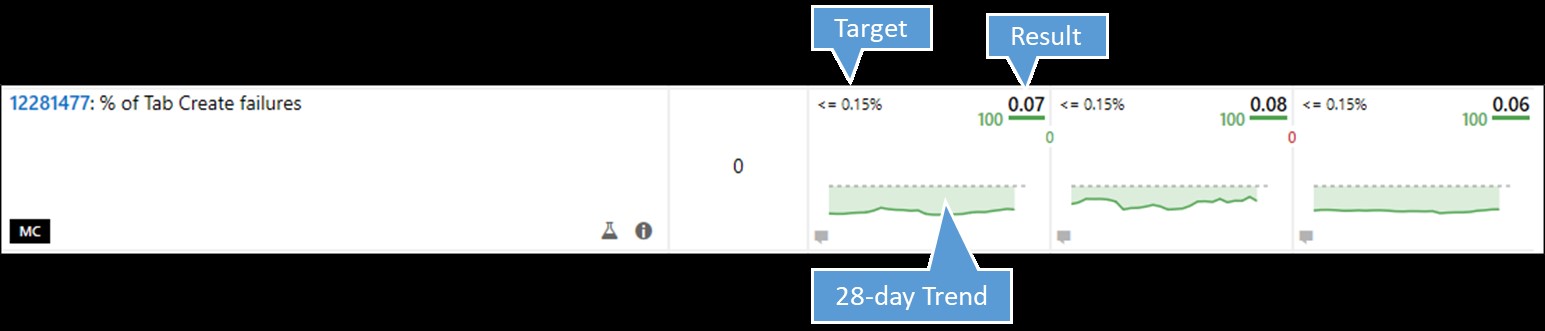
Comparison of tab creation failure rate for three different Windows 10 builds
Since the measure was within its target of .15 percent, averaging .07 percent within the last seven days, it gets a score of 100 (in green).
A more detailed view of the first chart shows more information about the number of instances and the daily averages:
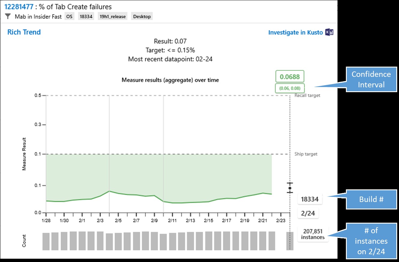
Detailed view of Tab Create failure measure
The grey bars at the bottom of the chart show the number of instances of that measure for that day. The confidence interval shows the range of results for that day, which on Feb. 24 was relatively narrow with 95 percent chance of the true mean falling within a .02 percent range that is well within target. If the measure were failing, we could drill from the chart to get machine learning-generated information about anomalous cohorts, or patterns of conditions among the failing devices, as well as correlations with known crashes. We can also seek additional diagnostic data to understand the root cause of the problem(s), to aid engineers on the Microsoft Edge team in fixing it quickly for a future build.
Progress, and more investment
We have come a long way in our quest to better understand and improve the quality of Windows through the signals we receive from Windows Insiders and in-market usage. We will continue to look for opportunities to make our listening and analytics systems more intelligent, all in an effort to provide you, our customer, with the best possible Windows experience. We are constantly looking to apply new and improved ways to augment our instrumentation and measures—for example, investing more in customer feedback to help us identify gaps or inconsistencies in our diagnostic data-based measures and provide insight into the experiences you have on your actual devices. We’re also investing in new machine learning models to foster earlier detection through text analytics. In short, we are on a journey of continuous improvement, and we’re using data and AI to make release decisions that are more informed and customer-centric, while also maintaining your privacy and trust.